Retail Shopping Cart

product
The Retail Shopping Cart allows members to shop insurance with ease.
Combining the learnings with business objectives to increase online shopping and minimize the need for agents assistance, we proposed a brand new simplistic guided shopping experience to help users understand the product and increase confidence in shopping online.

The team
I was responsible for UI/UX Design, Strategy, Wireframes and Prototyping
Myself as UX product design lead, 2 additional UX product designers, UX architect, design strategist, product manager, front-end and back-end developers, SME’s and business stakeholders.


Discovery - Benchmarking
We began by conducting a benchmarking exercise to survey and analyze a relevant digital experience landscape to identify exemplar and/or stand-out experiences to create a point of reference that inspires, guides, and informs the directionality of a new/updated experience design.
From there we complied our findings by TIE (Task, Interaction, and Experience) Inventory into a board that highlighted singular experiences that we found profound and compelling (and poor performers if that were especially notable)

Discovery - Exploring the Customer Journey
To begin understanding our members, we started with user interviews and surveys gathering qualitative data. We also analyzed existing quantitative data to gain insights on existing system flaws.

Findings
We worked with researchers to conduct the user testing where participants use a prototype to get a quote, compare plans, and enroll in a plan to validate our flows, screen and content designs in order to reveal possible usability problems and areas for improvement.
Unclear about the amount of content presented.
Users did not know what is SEP or qualifying event is.
Unclear why creating an account was required to enroll.
Users were often confused about why the site asks for specific information.
Users were overwhelmed with the plan options.
Navigating through RSC was difficult and felt disconnected.
Analytics Review
57% of users are unable to complete the RSC task in one sitting
70% of people drop out when presented “create an account”
7% of visitors purchase a plan after viewing plan options
43 member satisfaction score (46/100 average, industry wide)

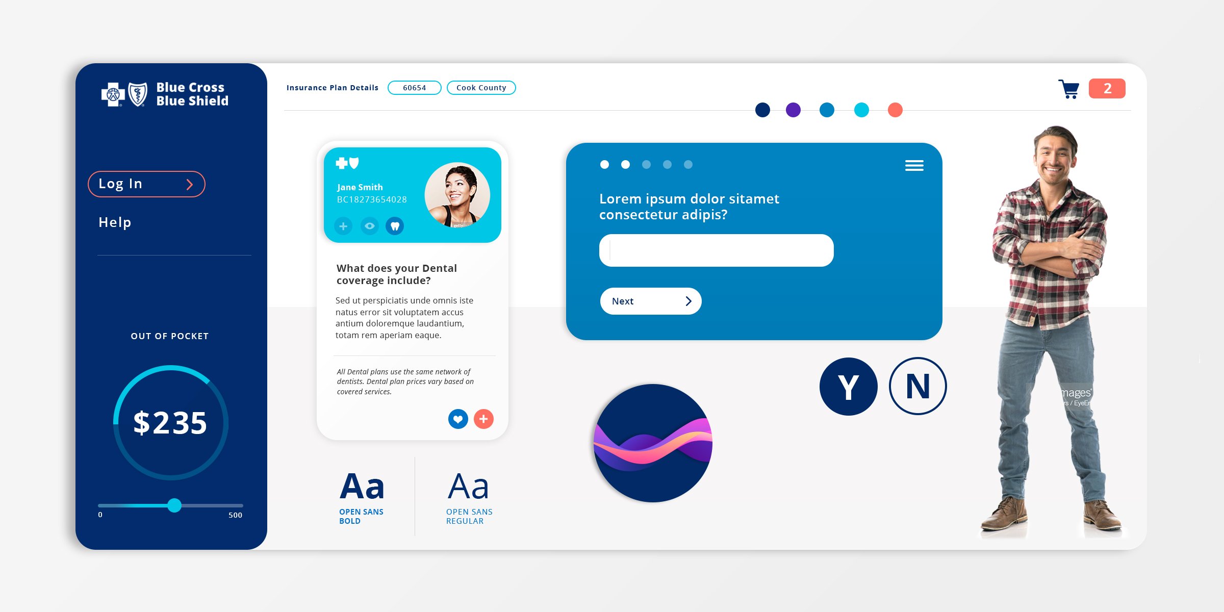
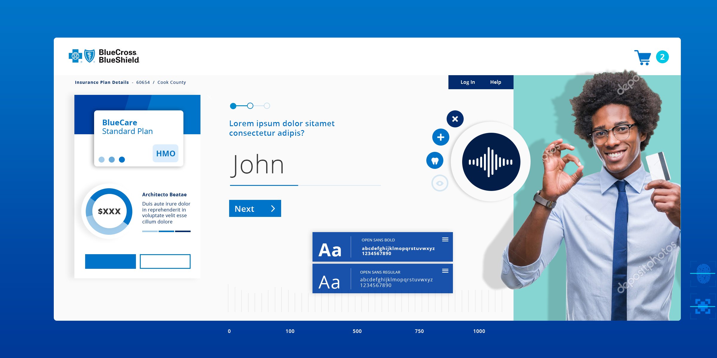
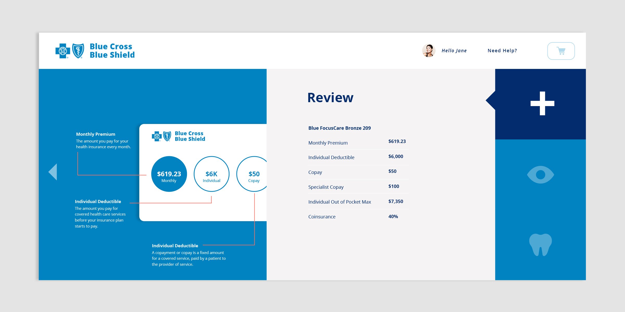
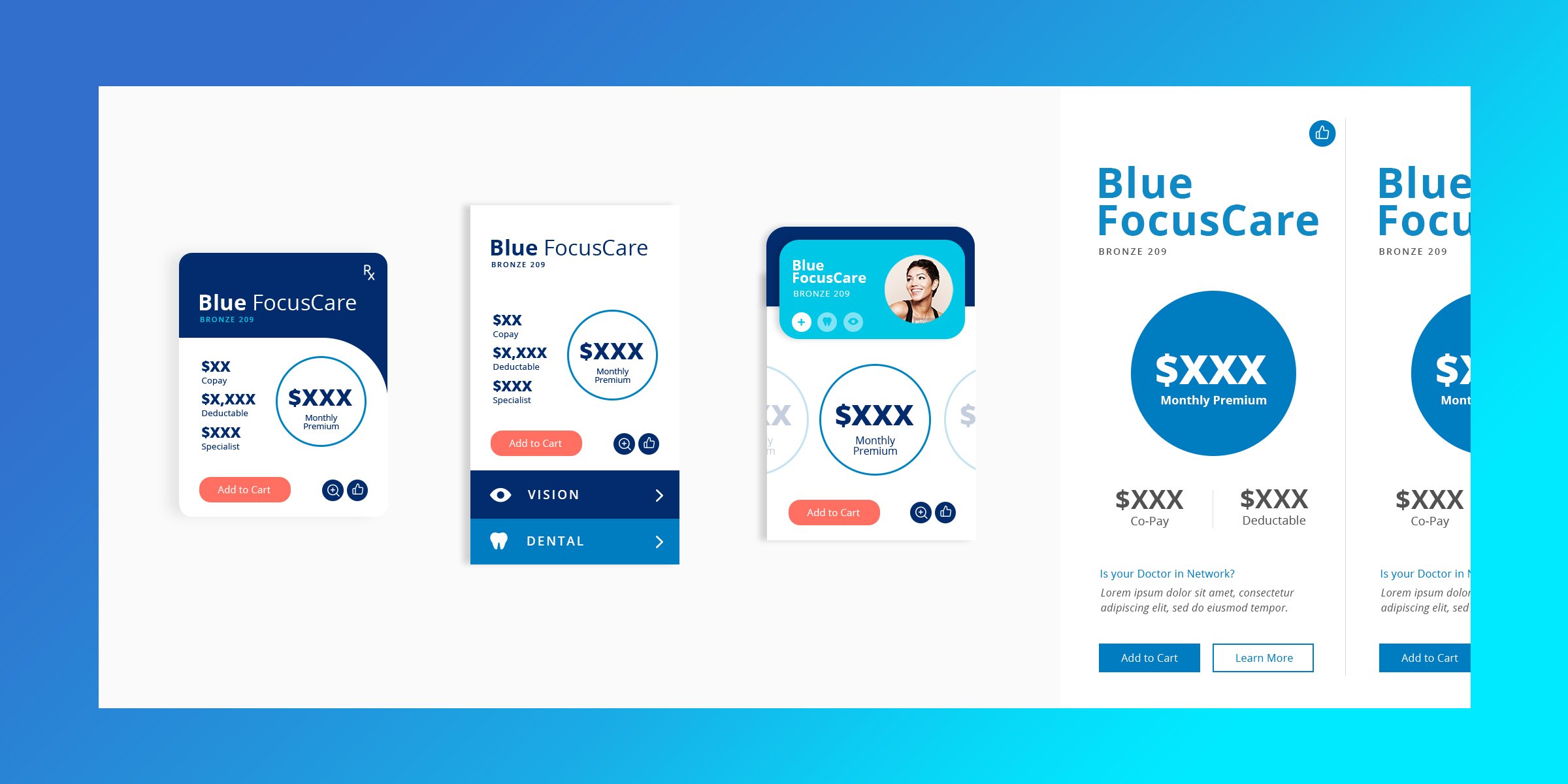
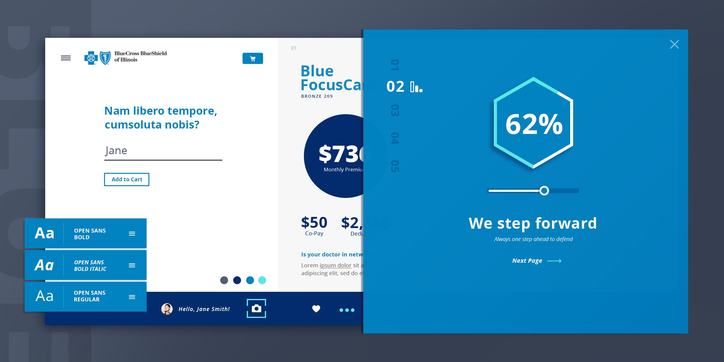
UI design
A big initiative of this project in addition to improving the user experience was updating the entire UI. Myself and another designer began the FIBER design system to promote consistency, and improve efficiency.
The design system included illustrations, components, patterns, icons, typography, and color concepts based around our discovery of the basic principles HCSC’s Blue Cross Blue Shield were based on: Guidance, Compassion and Protection.
UI Concept Boards